It’s back to school season, and at my house that’s already meant a lot of math. Both of my kids are taking quantitative science courses along with math courses, so every few nights I’m getting to help with math-related homework of one sort or another. It’s an interesting opportunity to see what I remember and don’t remember from when I took those classes, and what comes easier with more experience and what doesn’t. Fundamental principles seem to stick better than specific techniques. For example, I helped my son with a physics problem by setting up a system of five equations with five unknown quantities. Was that the simplest way to solve it, or was there some shortcut I was forgetting? I don’t know, I just knew my way would work.
Anyway, all that math made me think it was time for some mathematics to come to the blog. Two developments caught my eye. First, when is a proof not a proof? One way is when the proof is 500 pages long, employs idiosyncratic techniques, and is understood by maybe 10 people in the world. Such is the proof of the abc conjecture (or really its equivalent the Szpiro conjecture) offered by Shinichi Mochizuki in 2012. In the decade since, multiple attempts to verify the proof have resulted in some mathematicians satisfied that it is correct while others claim that they have identified a flaw in one step which breaks the proof. Mochizuki himself denies that there is a flaw in his proof and says that the issue lies instead with the reasoning of his critics.
Why all the fuss? The abc conjecture is an important idea in number theory. Many other conjectures, theorems and ideas would also be true if it turns out the abc conjecture is true. So a proof of the conjecture is also be extension a proof of all those other results, some of which are themselves unproven. And what is the abc conjecture? Consider the equation a + b = c. Let a, b and c be coprime, which means that they share no prime factors in common. An example would be 9 + 16 = 25. The only prime factor of 16 is 2 (16 = 24), the only prime factor of 9 is 3 (9 = 32) and the only prime factor of 25 is 5 (25 = 52). Now, take the product of the unique prime factors of all three–in our case, the unique factors are 2, 3, and 5 and their product is 30. Note that 30 is bigger than c which is 25. The abc conjecture sets a specific limit on the number of values of a, b and c that satisfy the equation a + b = c and are coprime and which have the opposite property, where c is bigger than the product of the unique factors of all three.
The recent development in the story is a $1 million prize. Entrepreneur Nobuo Kawakami is interested in the techniques Mochizuki developed for his proof and wants to see them developed further. So he’s willing to pay smaller amounts for the best paper on the topic each year, and the $1 million amount to anyone who can definitively disprove Mochizuki’s result. Hopefully he and the number theory community get his money’s worth.
If number theory and facts about coprimes are too esoteric for you, let’s head over to the world of applied mathematics and statistics. Statistics is all about summaries of data. It’s much easier to deal with one or two numbers, like say the mean and standard deviation, then an entire data set. But the tradeoff for that simplicity is that summary statistics don’t always provide a complete picture. The internet got a reminder of that in 2013 thanks to Spiders Georg. Max Lavergne took the popular but false stat about the average person eating 3 spiders a year and made a lesson about means. The fake stat is meant to shock you by getting you to think that everyone (unwittingly) eats something like 1 to 5 spiders a year, but Lavergne points out you’d get the same average if just about everyone ate no spiders while the fictional Spiders Georg ate more than 10,000 spiders a day. (“More than” is doing a lot of heavy lifting in that sentence, since it would actually need to be way more to get an average of 3 for every living person, but that’s beyond the scope of the joke.)
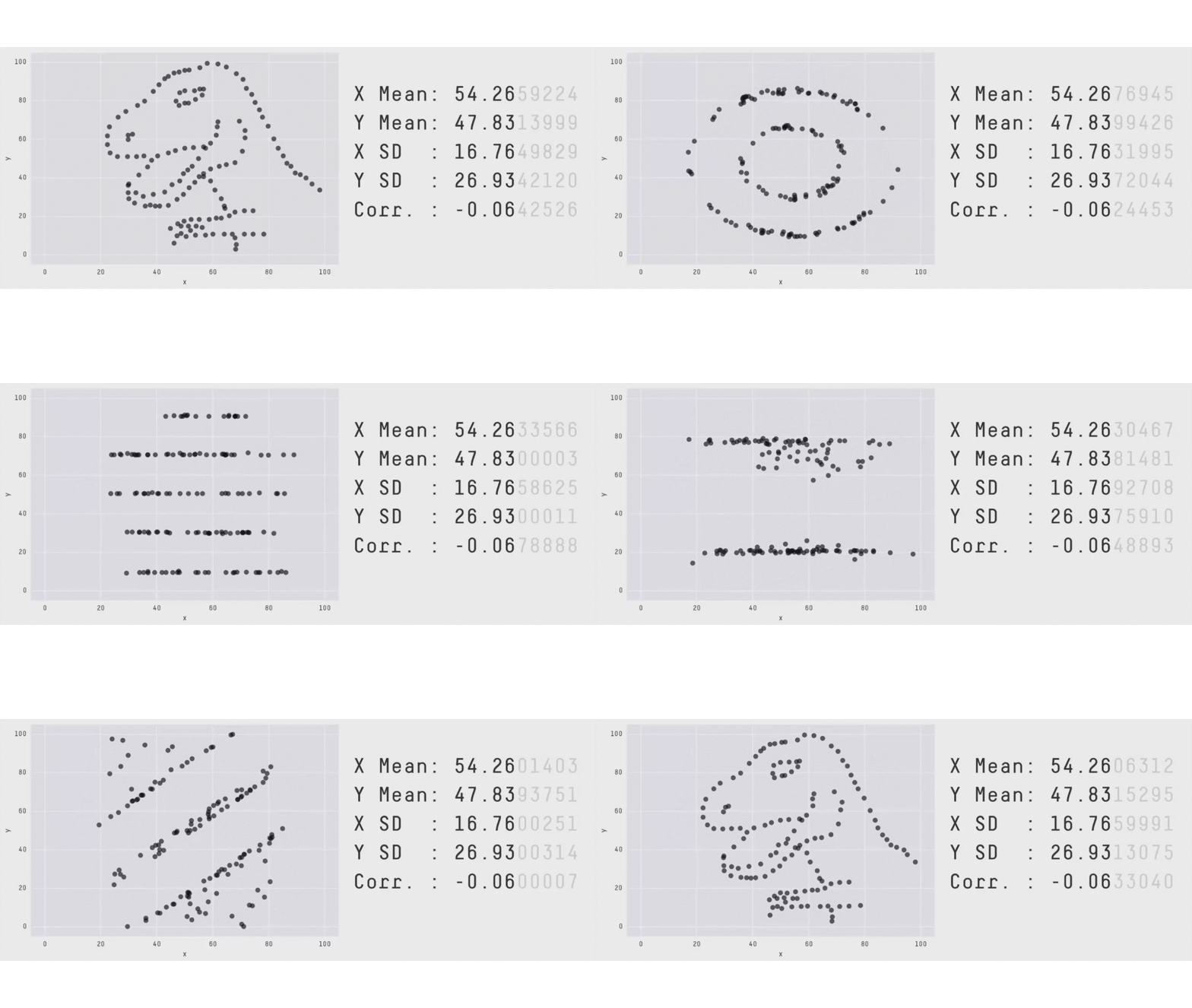
Francis Anscombe made a similar point in the 1970s to encourage his statistician colleagues to visualize their data in addition to computing summary statistics in order to get a more complete understanding of what it might have to say. To do this, he generated four plots of data representing two variables that are positively correlated. The means and variances and correlation of the two variables are identical for all four plots, but the overall relationship between the two variables is very different. One plot depicts a linear relationship like one might expect from the correlation, but another shows a more complicated relationship that goes up then down. There’s also a Georg-like scenario where a single outlier leads to strong positive correlation where there would be none if that outlier were excluded.
Anscombe made his point pretty clearly with his charts. Less clear, however, is how he made his charts. While perhaps not reproducing his method, other work has demonstrated methods for accomplishing similar outcomes, namely data sets with matching statistics but different charts. The latest method is not constrained to make any particular summary stats match and can target arbitrary shapes. You can watch a demonstration of the results below:

The lesson to be learned here is not that summary stats are deceptive or useless. They are tools with limitations just like any other tool. Instead, the message is the same as Anscombe’s, to use summary stats in conjunction with another tool, namely human visual perception and our ability to recognize patterns. Of course, that tool is limited too, and in particular it can see patterns where there aren’t any. So visual pattern matching needs statistics to verify possible patterns. The combination of the two tools is what is most powerful.
Back-to-school time also means back-to-school spread of respiratory pathogens. At our house, that has already meant back-to-school COVID-19. Just this week, the FDA approved and the CDC recommends a new vaccine that will likely be available in coming days. Expect this to be an annual pattern as with the influenza vaccine, with a new formulation each year to match the latest evolution of the virus. The annual influenza vaccine is currently available too, as are two new vaccines for respiratory syncytial virus (RSV) that have been recently approved for those over 65 and, in one case, pregnant people at 32-36 weeks of gestation to protect them and their babies. Which if any of these is right for you this year is a clinical decision between you and a healthcare provider. I just want folks to know these tools are available.
O, and if you do get COVID-19 and you take Paxlovid, know that it might put a bad taste in your mouth for the time you are taking it. Neither my physician nor my pharmacist mentioned this; if family hadn’t warned me (thanks!) I might have confused it for a symptom of the infection. So now I’m passing the info along.
Andy has worn many hats in his life. He knows this is a dreadfully clichéd notion, but since it is also literally true he uses it anyway. Among his current metaphorical hats: husband of one wife, father of two teenagers, reader of science fiction and science fact, enthusiast of contemporary symphonic music, and chief science officer. Previous metaphorical hats include: comp bio postdoc, molecular biology grad student, InterVarsity chapter president (that one came with a literal hat), music store clerk, house painter, and mosquito trapper. Among his more unique literal hats: British bobby, captain’s hats (of varying levels of authenticity) of several specific vessels, a deerstalker from 221B Baker St, and a railroad engineer’s cap. His monthly Science in Review is drawn from his weekly Science Corner posts — Wednesdays, 8am (Eastern) on the Emerging Scholars Network Blog. His book Faith across the Multiverse is available from Hendrickson.

You hinted at a method for generating multiple solutions in your opening paragraph. A system of 5 equations and 6 unknowns can generate infinite solutions – or a set of entertaining different solutions. 🙂
When I first looked at the problem, I thought I could do it in three equations and three unknowns. But once we started writing it out, I realized I had three equations but four unknowns which was, as you note, a recipe for shenanigans. Had to go to five to even things out.